
How Can Branding Help Churches?
Branding is often a strange subject for churches or charities - and understandably so! As you can imagine, the organisations we work with may not always have documented information about their brand. So we thought we'd ask our lead designer, Emma, to share her thoughts on church branding, it's importance and how to approach branding if you do not have well defined 'brand look'.
Isn't branding only relevant in the commercial sector?
We realise here at Church Pages that many churches we speak to feel uncomfortable with the concept of branding. This is understandable since it's something which feels very much rooted in the commercial world and tied up with marketing and selling, which are concepts which seem to have little to do with faith.
However, when it comes to your website, having some way of helping your site visitors feel at home and welcomed can only be done through non-verbal visual communication. Your website has to essentially do some of the job of the welcoming committee with their warm smiles and cups of tea, through purely visual means. The use of fonts, colours and images can change the feel of a website from urban and hip to traditional and historic. The use of certain imagery can really communicate who you are and create a warm feeling although we admit, it's not quite the same as having a plate of chocolate hobnobs to offer out, but it can come close.
Branding can help to communicate who you are, what you do, your voice, and your values. This is done through use of colour, design, choice of fonts and the kinds of imagery you use throughout your website as well as the tone of voice you use in your website content. When a new site visitor visits a church site which makes them feel at home, and welcomed, and like they'd fit in, they may be more likely to get in touch and come along.
Some churches already have a branding document drawn up before they get in touch with us. This is usually a document which shows the logo and how it can be used, the fonts to use and how to use them, the colours to use, and the kind of imagery to use. But what if you don't have one of these?
What if you don't have a branding document?
Most churches who approach us don't have a branding document, but most do have a logo. This, together with some thought about who you, your congregation, and your values are is the perfect starting point.
Most churches want to communicate an open, friendly welcoming feel for their websites that site visitors will instinctively trust. Trust can be built through clean uncluttered design and consistency of colours and fonts throughout the site.
You will need to choose the following:
- a main brand colour (often the main colour in the logo),
- a secondary colour (often a paler or neutral colour to the main brand colour).
- a complementary colour which is used to draw attention to the buttons and links throughout your website.
- fonts – one or two only. Generally, serif fonts can create a more traditional feel where sans serif can feel more modern. Something rounded, open and friendly is usually good for churches.
- images – it's good to make sure these are well lit, in focus and communicate the heart of your church. Ask yourself for each image if it fully conveys the feeling of your congregation, your activities and your values.
There is a great deal written about the psychology of colour choices. In brief though, blue is on the trusting end of the spectrum where red incites people to action. This is why a lot of churches tend towards the cool end of the colour spectrum for their main brand colour and the warmer end of the spectrum for their buttons and calls to action.
Once you've decided what to use. Make sure you make a note of your decisions and this is what will make up your branding document. Then try to follow using the same colours and fonts across all your visual communication including printed flyers, handouts etc as well as on your website.
Some examples of sites we've created who had no branding document but who have very distinct visual styles and who communicate who they are well through their use of fonts, colours and images can be seen here with The Ignite Trust and The Vine Church.
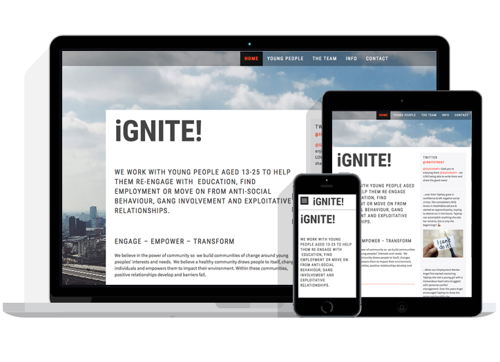
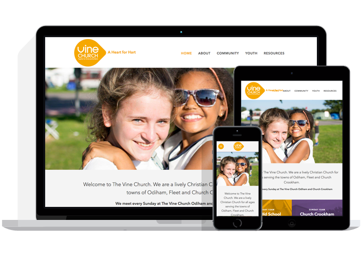
Ignite has a more urban gritty feel to reflect the work they do working with young people to move away from anti-social behaviour, gang involvement, and exploitative relationships, and it needs to appeal to that audience. Meanwhile, The Vine Church has a softer look to appeal to all ages while still being modern and clean. Both use consistent colours, imagery and fonts throughout to communicate a similar feel throughout each site.
Branding can be better thought of as building trust through consistency
So, we've discussed why branding is relevant for churches and looked at how to approach this, if you don't have a brand document. To conclude, branding can be better thought of as using a consistent visual look to build trust. When reaching out online, it can be hard to build that trust with your visitor - so a consistent look and feel will really help!
Can we help?
We hope this has been helpful for your organisation and if you'd like to chat though further how we could help you online, do not hesitate to get in touch and our team would be happy to speak to you.